Jump to Visuals
Visuals


Personal Content Management
Personal Content Management
Personal Content Management
Smart Rediscovery App
Smart Rediscovery App
Smart Rediscovery App
UX/UI Designer
UX/UI Designer
2026
2026
Academic Project
Academic Project
Figma
Figma
01
01
01
" width="1200px"/></svg>)
Overview
Overview
Overview
In an era of endless content, we save more than ever, articles, videos, recipes, ideas, across dozens of platforms
Yet almost none of it gets revisited. The saved folder becomes a graveyard, not a library
In an era of endless content, we save more than ever, articles, videos, recipes, ideas, across dozens of platforms. Yet almost none of it gets revisited. The saved folder becomes a graveyard, not a library
In an era of endless content, we save more than ever, articles, videos, recipes, ideas, across dozens of platforms
Yet almost none of it gets revisited. The saved folder becomes a graveyard, not a library
StaShh is a personal content hub that unifies everything saved across platforms into one place, designed to close the gap between saving and actually consuming, making it easy to organize, find, and actually return to the things that matter
StaShh is a personal content hub that unifies everything saved across platforms into one place, designed to close the gap between saving and actually consuming, making it easy to organize, find, and actually return to the things that matter
02
02
02
User Research
User Research
User Research
To understand the problem firsthand, I ran a survey with 48 participants and conducted 2 in-depth user interviews focusing on how people save, organize, and revisit digital content
To understand the problem firsthand, I ran a survey with 48 participants and conducted 2 in-depth user interviews focusing on how people save, organize, and revisit digital content
What I found
What I found
The data confirmed what I suspected, people save constantly, but rarely return, 81% of users save content weekly, yet the majority never revisit it. The friction isn't in the saving it's in everything that comes after
The data confirmed what I suspected, people save constantly, but rarely return, 81% of users save content weekly, yet the majority never revisit it. The friction isn't in the saving it's in everything that comes after
What resonated most
What resonated most
The survey revealed a deeper emotional layer, users aren't just losing content, they are losing control. This manifests as 'Digital Guilt' a near-universal feeling of being overwhelmed by an unmanageable backlog that they recognize immediately
The survey revealed a deeper emotional layer, users aren't just losing content, they are losing control. This manifests as 'Digital Guilt' a near-universal feeling of being overwhelmed by an unmanageable backlog that they recognize immediately
In their own words
In their own words
"My 'Saved' folders are where good content goes to die. It’s so cluttered that looking at it just makes me feel overwhelmed instead of inspired"
"My 'Saved' folders are where good content goes to die. It’s so cluttered that looking at it just makes me feel overwhelmed instead of inspired"
- Or, 23
"I know I saved that article somewhere, but searching through five different apps feels like a second job. Most of the time, I just give up"
"I know I saved that article somewhere, but searching through five different apps feels like a second job. Most of the time, I just give up"
- Asaf, 36
03
03
03
Competitive Analysis
Competitive Analysis
Competitive Analysis
Before designing StaShh, I analyzed existing tools to understand what's already out there and where the gaps are
Before designing StaShh, I analyzed existing tools to understand what's already out there and where the gaps are

A dedicated read-later app for saving articles and web content
A dedicated read-later app for saving articles and web content
✓
✓
✓
Clean, focused reading experience
Simple one-click saving from the browser
Offline access to saved content
Clean, focused reading experience
Simple one-click saving from the browser
Offline access to saved content
Clean, focused reading experience
Simple one-click saving from the browser
Offline access to saved content
✗
✗
✗
Limited to articles
No reminders or time-based resurfacing
Weak organization, tagging exists but rarely used
Limited to articles
No reminders or time-based resurfacing
Weak organization, tagging exists but rarely used
Limited to articles
No reminders or time-based resurfacing
Weak organization, tagging exists but rarely used

Raindrop.io
Raindrop.io
Raindrop.io
A visual bookmark manager for organizing links across topics
A visual bookmark manager for organizing links across topics
✓
✓
✓
Beautiful visual layout with thumbnails
Strong tagging and collection system
Works across all content types
Beautiful visual layout with thumbnails
Strong tagging and collection system
Works across all content types
Beautiful visual layout with thumbnails
Strong tagging and collection system
Works across all content types
✗
✗
✗
Saving flow is not seamless on mobile
No reminder or resurfacing system
Not intuitive for casual users
Saving flow is not seamless on mobile
No reminder or resurfacing system
Not intuitive for casual users
Saving flow is not seamless on mobile
No reminder or resurfacing system
Not intuitive for casual users

Notion
Notion
Notion
A productivity workspace that many users repurpose for saving content
A productivity workspace that many users repurpose for saving content
✓
✓
✓
Extremely flexible and customizable
Works for any content type
Great for power users who like structure
Extremely flexible and customizable
Works for any content type
Great for power users who like structure
Extremely flexible and customizable
Works for any content type
Great for power users who like structure
✗
✗
✗
Requires manual setup for every use case
Not designed for quick, frictionless saving
No personalization or smart resurfacing
Requires manual setup for every use case
Not designed for quick, frictionless saving
No personalization or smart resurfacing
Requires manual setup for every use case
Not designed for quick, frictionless saving
No personalization or smart resurfacing
04
04
04
Persona
Persona
Persona
Always on the move, saving content between lectures, shifts, and commutes. By the time she has the headspace to actually read it, she can't find it

Maya Grosman, 23 Industrial Engineering student, working part-time
Maya Grosman, 23 Industrial Engineering student, working part-time
Always on the move, saving content between lectures, shifts, and commutes. By the time she has the headspace to actually read it, she can't find it
Always on the move, saving content between lectures, shifts, and commutes. By the time she has the headspace to actually read it, she can't find it
Frustrations
Frustrations
Saves across 4 different apps with no single source of truth
Saves across 4 different apps with no single source of truth
Retrieval feels like a second job
Retrieval feels like a second job
A growing backlog that creates guilt instead of curiosity
A growing backlog that creates guilt instead of curiosity
Needs
Needs
Frictionless saving that doesn't interrupt her flow
Frictionless saving that doesn't interrupt her flow
Smart organization she doesn't have to maintain manually
Smart organization she doesn't have to maintain manually
Reminders that surface content when she finally has time
Reminders that surface content when she finally has time
Behavior
Behavior
Saves on-the-go, consumes during downtime
Saves on-the-go, consumes during downtime
Mobile-first, high tech literacy
Mobile-first, high tech literacy
Values speed and clarity over features
Values speed and clarity over features
05
05
05
From Chaos to Clarity
From Chaos to Clarity
From Chaos to Clarity
What people are doing instead
What people are doing instead
Without a real solution, users default to fragmented workarounds
Without a real solution, users default to fragmented workarounds
Sending links to themselves on WhatsApp
Saving raw URLs in phone notes without context
Bookmarking content within each app separately
Burying screenshots deep in their camera roll
Sending links to themselves on WhatsApp
Saving raw URLs in phone notes without context
Bookmarking content within each app separately
Burying screenshots deep in their camera roll
None of these methods provide a reliable way to actually revisit or rediscover the content
None of these methods provide a reliable way to actually revisit or rediscover the content
How StaShh fixes it
How StaShh fixes it
Instead of scattered workarounds, StaShh gives users one place to capture everything, directly from any app, in one tap. Content is automatically organized, visually previewed, and resurfaced at the right moment through reminders
Instead of scattered workarounds, StaShh gives users one place to capture everything, directly from any app, in one tap. Content is automatically organized, visually previewed, and resurfaced at the right moment through reminders
No more searching. No more guilt. Just the content you saved, when you actually have time for it
No more searching. No more guilt. Just the content you saved, when you actually have time for it
06
06
06
UX Focus
UX Focus
UX Focus
Saving content should feel effortless but returning to it is where most apps fail
The design of StaShh was guided by one core question - how do I make sure saved content actually gets used?
Saving content should feel effortless but returning to it is where most apps fail
The design of StaShh was guided by one core question - how do I make sure saved content actually gets used?
Built around four core ideas
Built around four core ideas
Frictionless capture - Saving happens in one tap, without leaving the app you're in. The less friction at the entry point, the more likely users are to actually save
Frictionless capture - Saving happens in one tap, without leaving the app you're in. The less friction at the entry point, the more likely users are to actually save
Reduce the backlog anxiety - A long unread list creates guilt, not motivation. StaShh breaks content into manageable views so users feel in control, not overwhelmed
Reduce the backlog anxiety - A long unread list creates guilt, not motivation. StaShh breaks content into manageable views so users feel in control, not overwhelmed
Surface content at the right moment - Reminders aren't just notifications, they're a bridge between the moment of saving and the moment of consuming
Surface content at the right moment - Reminders aren't just notifications, they're a bridge between the moment of saving and the moment of consuming
Search that thinks like a user - People don't remember file names, they remember context. The search is built around tags, dates, and visual previews, not just keywords
Search that thinks like a user - People don't remember file names, they remember context. The search is built around tags, dates, and visual previews, not just keywords
Frictionless capture - Saving happens in one tap, without leaving the app you're in. The less friction at the entry point, the more likely users are to actually save
Reduce the backlog anxiety - A long unread list creates guilt, not motivation. StaShh breaks content into manageable views so users feel in control, not overwhelmed
Surface content at the right moment - Reminders aren't just notifications, they're a bridge between the moment of saving and the moment of consuming
Search that thinks like a user - People don't remember file names, they remember context. The search is built around tags, dates, and visual previews, not just keywords
07
07
07
User Flow
User Flow
User Flow
Saving Content
Saving Content

Finding & Consuming Content
Finding & Consuming Content

08
08
08
What I want users to feel
What I want users to feel
What I want users to feel
In control
Not overwhelmed. The saved list should feel like a curated library, not a pile of forgotten links
Not overwhelmed. The saved list should feel like a curated library, not a pile of forgotten links
Calm
The interface is quiet and uncluttered, so users can focus on the content, not the app
The interface is quiet and uncluttered, so users can focus on the content, not the app
Confident
Knowing that everything they save is organized, findable, and won't disappear into the void
Knowing that everything they save is organized, findable, and won't disappear into the void
Rewarded
When a reminder surfaces exactly the right content at the right moment, saving feels worth it
When a reminder surfaces exactly the right content at the right moment, saving feels worth it
09
09
09
Visual Language
Visual Language
Visual Language
Typography
Sen
Aa
Regular Semi Bold
a friendly, rounded sans-serif that brings warmth without sacrificing readability
a friendly, rounded sans-serif that brings warmth without sacrificing readability
Color Palette
#FFFFFF
#F0F0F0
#989898
#323232
#EC6F46
Soft grays keep the interface calm and distraction-free, with a single orange accent for all key actions
Soft grays keep the interface calm and distraction-free, with a single orange accent for all key actions
The logic behind it
The logic behind it
The design steps back, so the content feels like the hero, not the interface
The design steps back, so the content feels like the hero, not the interface
The design steps back, so the content feels like the hero, not the interface
10
10
10
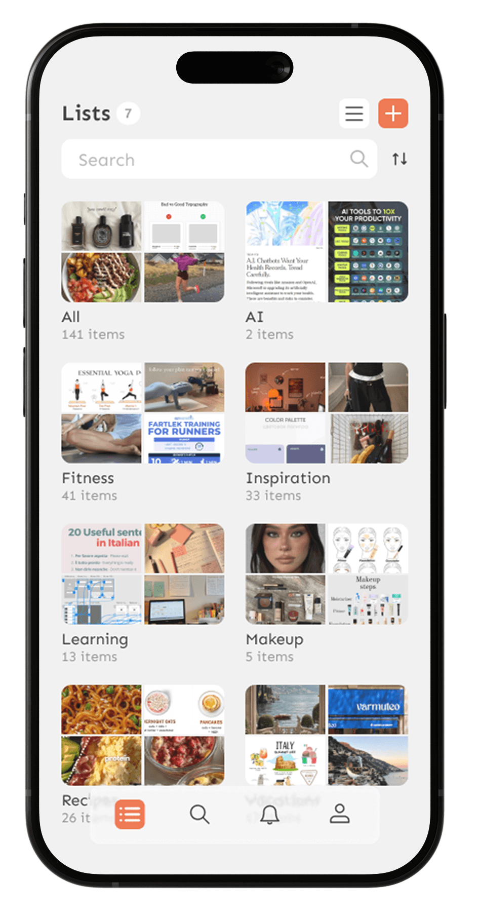
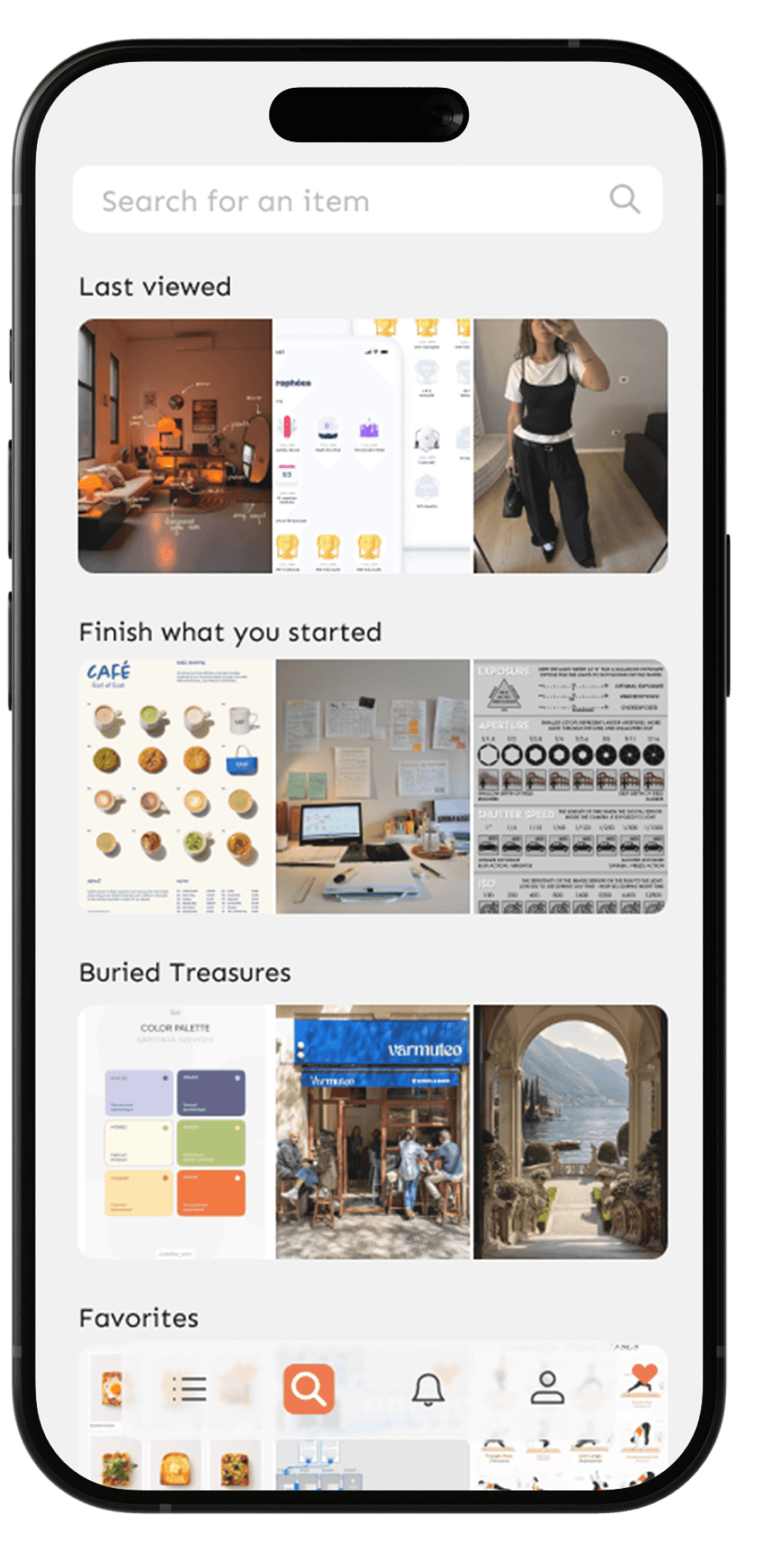
Main Screen
Main Screen
Main Screen
The central hub for all saved content organized into lists by topic. Users can switch between List and Gallery views based on how they prefer to browse
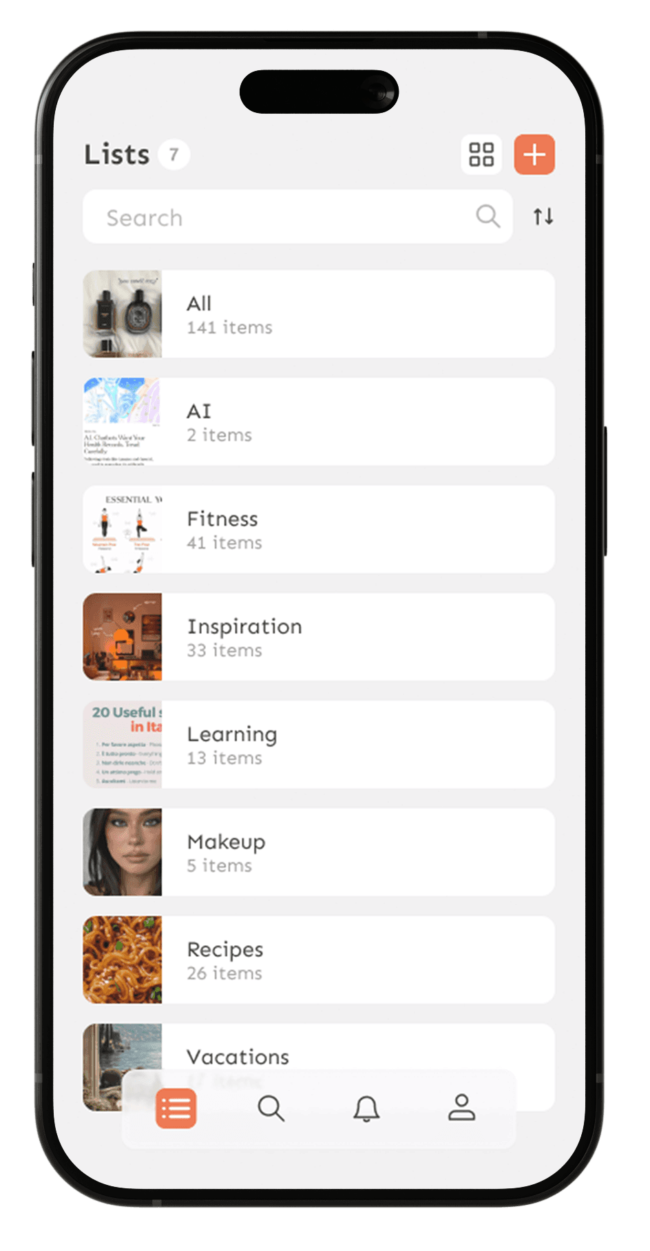
List view
for users who know what they're looking for. Scannable, efficient, and minimal
Gallery view
for users who browse by feel. Visual previews spark memory and make rediscovery enjoyable
No home screen by design
Users come to StaShh to access their content, not to see a summary of it. Skipping the home screen and landing directly on the Lists screen removes an unnecessary step, keeping the focus on what matters, the saved items themselves
Inside a list, content is filtered by type so users can find exactly what they're looking for without scrolling through everything
11
11
11
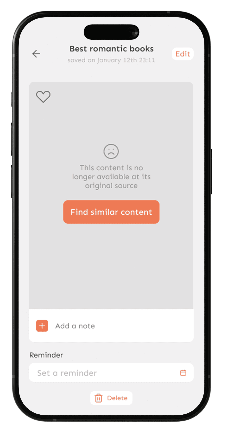
Item Screen
Item Screen
Item Screen
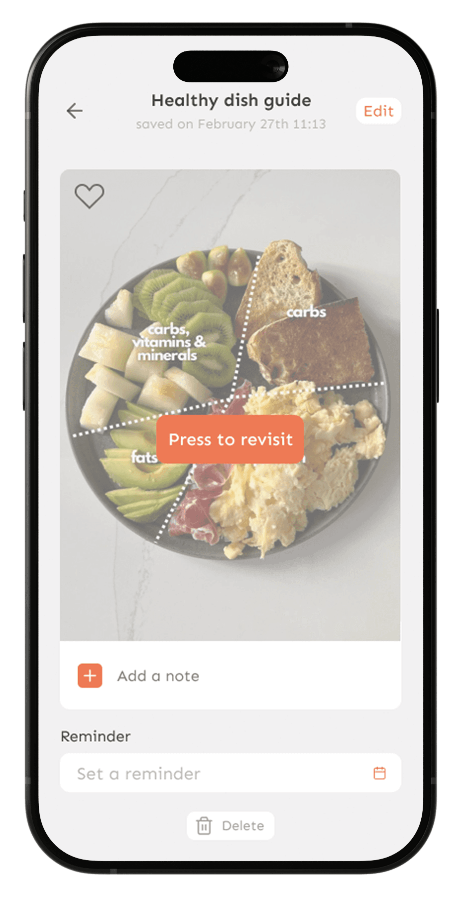
A single tap opens the original source, keeping the experience frictionless

Edit mode gives users full control, rename, move to a different list, update the link, or add context notes
12
12
12
Search Screen
Search Screen
Search Screen
Research showed two distinct search behaviors, users who come in knowing exactly what they want, and users who need a nudge to rediscover content they've forgotten they saved. The search screen was designed to serve both
I looked at how leading apps handle both active search and passive discovery, TikTok's For You logic, Pinterest's visual exploration, Spotify's mood-based playlists, and Instagram's personalized Explore page. Each solves a different piece of the puzzle, I took the best from all of them
The result is a search screen that serves both intents, precise retrieval when users know what they want, and personalized discovery when they don't
Discovery mode for users who need a nudge. Personalized sections surface forgotten and relevant content based on saving habits and consumption patterns
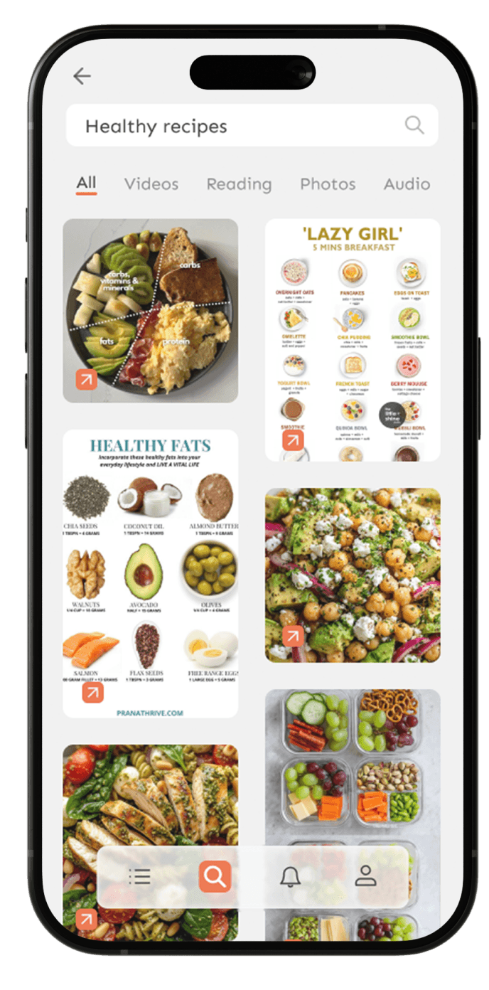
Active search for users who know what they're looking for. Search by keyword, date, or date range
Active search for users who know what they're looking for. Search by keyword, date, or date range
13
13
13
Notifications Screen
Notifications Screen
Notifications Screen
This is the screen that directly solves the core problem StaShh was built for the feeling of losing control over saved content
This screen is split into two tabs, each solving a different problem
Reminders
Set on your own terms, a gentle nudge back to saved content, exactly when you have time for it
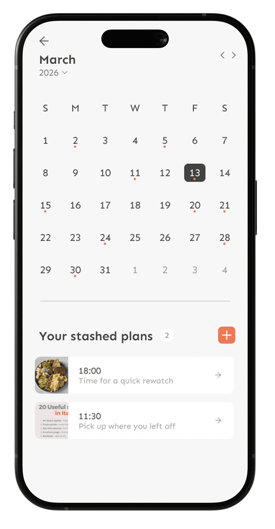
Calendar view a monthly overview for users who think in dates, see all scheduled reminders at a glance
Calendar view a monthly overview for users who think in dates, see all scheduled reminders at a glance
Reminders show up exactly when you asked them to, no guessing, no searching
Reminders show up exactly when you asked them to, no guessing,
no searching
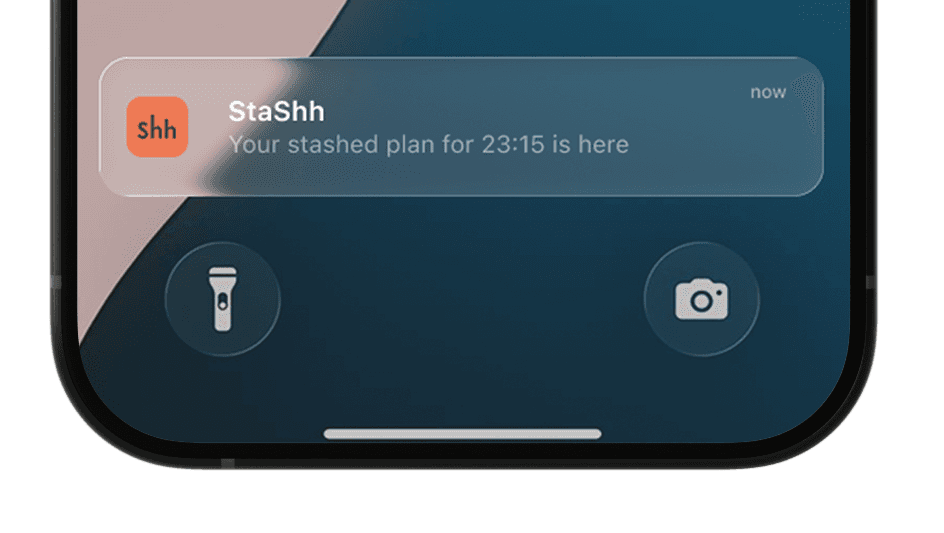
Notifications
proactive alerts that keep the library clean and alive
Not just passive updates, but actionable moments
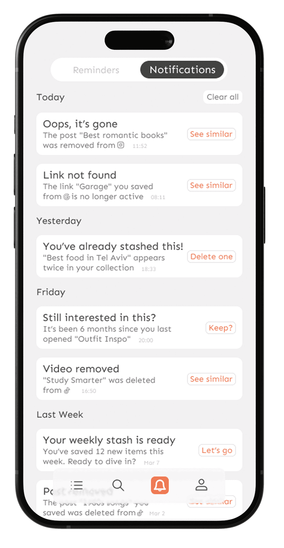
When content is deleted from the source, the app doesn't just show an error, it turns a dead end into a next step
"Find similar content" keeps the user moving forward instead of hitting a wall
When content is deleted from the source, the app doesn't just show an error, it turns a dead end into a next step "Find similar content" keeps the user moving forward instead of hitting a wall
This was a deliberate UX decision, even when something goes wrong, the experience should feel handled, not broken.
14
14
14
Saving Flow
Saving Flow
Saving Flow
Content enters StaShh in two ways, wherever the user happens to be
Both paths lead to the same place, one organized, searchable library
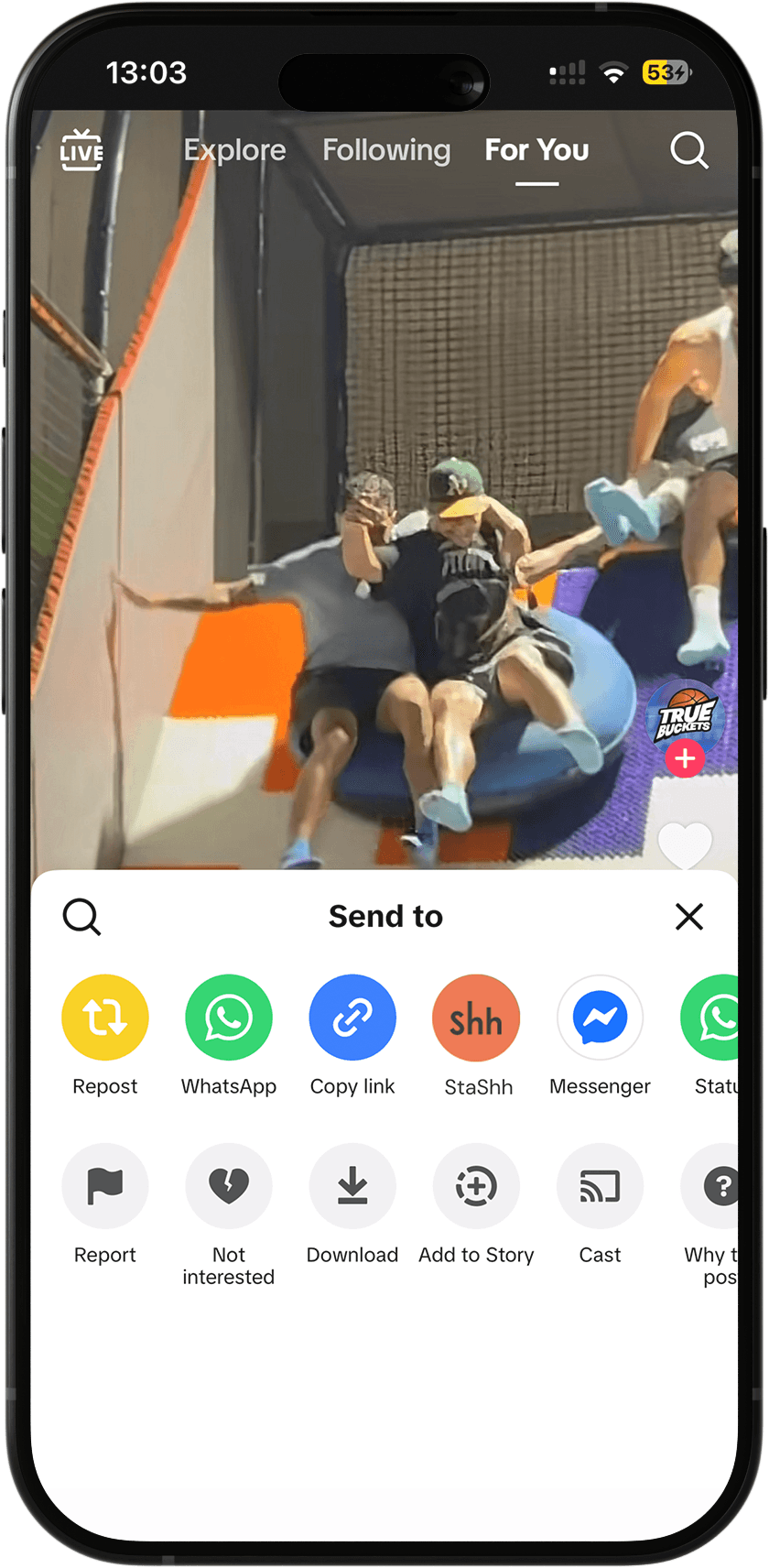
From any external app, tap Share, select StaShh, and the item is saved instantly without leaving the app

Manually within StaShh, paste a link directly for content that doesn't have a native share option
15
15
15
Tools & Process
Tools & Process
Tools & Process


I integrated Claude directly into my workflow using MCP (Model Context Protocol), creating a seamless bridge with Figma. This allowed the AI to analyze live design structures in real-time, helping me refine copy, validate accessibility, and pressure-test UX decisions without leaving the canvas
I integrated Claude directly into my workflow using MCP (Model Context Protocol), creating a seamless bridge with Figma. This allowed the AI to analyze live design structures in real-time, helping me refine copy, validate accessibility, and pressure-test UX decisions without leaving the canvas
To elevate the product's voice, I leveraged Gemini and other LLMs to iterate on UX Writing and microcopy, ensuring the interface speaks the user's language while maintaining a consistent brand voice across complex edge cases. By using Gemini as a dedicated copy partner, I was able to rapidly test multiple narrative directions and refine every string to be clear, concise, and user-centric. Beyond execution, I used Perplexity for sourced research into user behavior and industry standards
To elevate the product's voice, I leveraged Gemini and other LLMs to iterate on UX Writing and microcopy, ensuring the interface speaks the user's language while maintaining a consistent brand voice across complex edge cases. By using Gemini as a dedicated copy partner, I was able to rapidly test multiple narrative directions and refine every string to be clear, concise, and user-centric. Beyond execution, I used Perplexity for sourced research into user behavior and industry standards
AI didn’t replace the thinking, it provided a high-context environment to accelerate it, from the first wireframe to the final, polished string of copy
AI didn’t replace the thinking, it provided a high-context environment to accelerate it, from the first wireframe to the final, polished string of copy
The graveyard is officially closed
The graveyard is officially closed
The graveyard is officially closed
Explore the interactive prototype and see StaShh in action
Explore the interactive prototype and see StaShh in action
Explore the interactive prototype and see StaShh in action
Prototype
